Monday, May 12, 2014

Field Navigation: GPS and Paintball

Introduction

Using a GPS has become part of the mainstream in the world of navigation. This exercise was similar to the previous weeks exercise, but now the groups were using GPS units instead of  maps and compasses. The Priory was again the area of navigation. Another added bonus to this exercise was the implementation of paintball markers.

Methods

Before this navigation exercise the groups had to recreate the navigation maps of the previous exercise. The maps had some added features this time. The most notable of the additions was a path of travel. Each group seemed to have a path of travel to each point. This was also something new. Every group had to go to every point instead of a few selected points, but the starting points were different. Each group determined their own path and went with it. The maps that were created in ArcMap were imported into a Juno Trimble GPS and were used in the mobile Arc variant that is ArcPad.  The group moved along the path to each point.
Figure 1: Me, Eric Fabian, checking if the paintball marker is ready for use


 Navigation

Our group had point 10 as our starting point. This point was on the opposite side of the Priory and our group made quite a trek to the starting point. The GPS points were exactly where they were supposed to be. The route of travel went through the very wooded area and travel was quite treacherous. For added protection we had our paintball markers. It was not until our second point that we met another group and had to open fire. I believe that the group already had their point and retreated. The point were still difficult to find as moving with the GPS can still be tricky to read.

Figure 2: The groups map and points. One can see that the points are a bit off but that is due to numerous reasons.
Discussion

Added paintball markers was a fun addition. The GPS unit to me was still a bit difficult to read and navigating through the woods was still the same as the previous week. I think that compared to one another the GPS may be only slightly more helpful but a map and a compass definitely fulfills the need of travel.

Conclusion

Using a GPS to navigate has become the mainstay of today. GPS points can be accurately found in a timely manner as long as navigated correctly. The area to me plays the most on navigation. Being able to have this skill and being able to teach it also helps.

First Navigation Map and Compass

Introduction

This weeks exercise was the fulfillment and use of the navigation maps that were made in exercise 5. The class went to the Priory and were tasked to use a map and compass to find points around the Priory. Once the point was located the group used a punch card to mark that they had been there.

This navigation exercise helps one understand that technology will not always be readily available. To be able to use a map and a compass is a reliable skill.

Study Area/Course

The Priory is a large plot of land, roughly 112 acres, that was purchased by UW-Eau Claire in October 2011. The facility is used to house students, hold a daycare, and be used for educational purposes. The land is mostly wooded and this is where our group navigated. Each group had a separate area to navigate.

Methods

Displaying 20140421_172314.jpg
Figure 1: Morgan pointing towards an area that could be the direction of a point
The class was divided into 6 groups of 3 members. Each group had to use 2 maps chosen by the group. These maps were created for exercise 5. Group 3 had area 3 which were points 11-15. The starting point for the group was a gazebo on the back side of the Priory facility. The group received multiple maps and had to plot the points using reference grids that were on the map. Two sets of coordinates were given for each point. The coordinates were in both UTM and decimal degrees. Once the points were plotted the group used the compass and a map to go towards the direction of the point. The method of finding a point includes plotting line of direction and then using the compass to find north on the map. Once north is found turn the compass to find the degree of the point. This is called the azimuth, the direction of the point and travel. If a point is at the 280 degree mark place the arrow so that it is red in the shed. Keep the arrow in the degree area to find the point. To find the distance one uses a scale bar from a map.
Displaying 20140421_172332.jpg
Figure 2: One of the maps used for navigation

Displaying 20140421_172302.jpg
Figure 3: Lee quite pleased with finding one of the markers
Discussion

This method of finding direction was difficult at first to say the least. At first the group could not find the flag and accidentally stumbled upon flag 14. This flag was one of the points that needed to be found. The group decided that working backwards was the best option since the group was so close to the final flag at 15. The hardest part of the exercise was simple miscalculations. These simple problems caused the group to be far enough away from the flags not to find them

Conclusion

Using a map and compass seems archaic, but this exercise showed that it is a useful tool. Using these methods can be very beneficial.

Aerial Mapping With UAS I and II


Introduction
Aerial imagery can be processed and used in many different ways for many different reasons. The broader view and different vantage points of aerial imagery are huge benefits for many different reasons. Equipment that utilizes aerial imagery can be in the form of a balloon, kite, UAS, or rocket. The class used to of the former ways, the UAS and balloon, to view and process aerial imagery. Many preparations go into aerial imagery including using cameras, GPSs and other technical equipment. The class got to go outside and test the equipment at the Eau Claire Soccer Fields. This blog is two-fold. The first part is focused on image taking, processing, and the mosaic method. While the second half is a UAS mission pre-planning and flight.

Study Area
The Eau Claire Soccer Fields are located approximately 1 mile south of UW-EC campus. The fields are a large open area near residential housing and the Eau Claire Indoor Sports Center. The openness of this area allows for great flying. The area was suitable for the balloon because it had a great range of motion and could fly very high (500 ft). This ability to fly high allowed for a larger area to be captured. For the UAS the openness of the area allowed for easy maneuvering and easily accessible control points.  

Methods
The balloon was a simple large rubber helium balloon attached to a string with a picavet rig. The picavet rig is attached to the string and is where the camera and GPS are attached. Two cameras were attached to the picavet rig, these were a Canon Sx260 and a Canon Elf. The reason for 2 cameras is to get as many shots as possible and see the difference that multiple mediums take in the same area. The GPS was attached to know where the location was for the future process of mosaicing. Once all the equipment was set up the balloon was then lifted into the air at preplanned height of 500 feet. The class then walked around the field to capture multiple images. The route that the class walked was made to utilize the largest area so that many images could be captured. The route was made for minimal overlap, but some overlap is good. Hundreds of images were collected for mosaicing.
After the fieldwork was all done image mosaicing had to take place. Image mosaicing is basically stitching images together to make one large image. This is where hundreds of images come in handy as well as overlapping of images.
Displaying 20140407_145238.jpg
Figure 1: The balloon before take off. This shows a size reference for the balloon.
Displaying 20140407_145939.jpg
Figure 2: The two cameras and the GPS mounted on the picavet rig
Displaying 20140407_152658(0).jpg
Figure 3: The balloon ascending into the air
PhotoScan
To create mosaiced images in Photoscan add the photos you want under the Workflow tab. After adding the photos go back to Workflow and select Align Photos. This alignment of photos creates Point Cloud which are points of the photos. After the alignment select Build Mesh from Workflow. The mesh will create a TIN which is a Triangular Integrated Network. This means that triangles are created from points to create pieces of an image. In tabs click Texture. To export the image to use in other program click Export Orthophoto. The best option is to save it as a TIFF. After the TIFF is saved and exported open ArcMap. This step is needed only if the image is not geotagged. To geotag the image open Geoprocessing. Open an image of Eau Claire that has been geotagged. Click Viewer which is the magnifying glass this opens a spate view with the area that is not georeferenced. Adding control points to the image will help geotag. To get the track log another software program is used. This is Geosetter. Geosetter will help create GPS points and rectify the image.
Figure 4: An image mosaiced together in Photoscan. As one can see the area is quite large

Figure 5: Another mosaiced image from Photoscan


UAS Methods
There are many pre-planning methods that go into UAS use. If any step is missed the whole operation could be a mess. Tests should be ran before the UAS start up.  This includes waiting for a GPS connection and a connection between the UAS and software that is used to fly. The software the Professor Joe Hupy uses is Mission Planner. Mission Planner is freeware that can be used by anyone. Connection to Mission Planner from the UAS is signified by a green light on the software. No less than 3 people should run a UAS mission. The 3 members ideally should be a pilot who manually controls the UAS, a pilot at the computer, and an engineer that knows all the software. One should first know the topography of the land before flying as to best map out a flight plan.
Displaying 20140414_145507.jpg
Figure 6: Professor Hupy using the Mission Planner software prior to UAS launch
For Mission Planner there is a grid of points. These points are referred to as waypoints and are number in sequence. The first point is home and the UAS will return home when it has hit all the points. If the UAS is at 60% and is not close to home the pilot should force the UAS to go home. Once the UAS lands the pilot disarms the UAS and makes sure that everything is off. Professor Hupy’s Y6 rotocopter has a flight time of roughly 15-20 minutes. The area that was chosen had a flight plan less than that so no issues arose.

Displaying 20140414_145743.jpg
Figure 7: Professor Hupy's Y6 rotocopter prior to flight. Next to the copter is the controller
Discussion
UAS and other alternative aerial imagery processes have many positives and UAS definitely looks to be the future of aerial imagery and remote sensing. With UAS the cost is cut down and the areas acan be explored more broadly. The alternative of UAS is a booming industry and can be used for anything from police work to agriculture.

Conclusion

UAS removes the human element and allows for a more expansive area of work. The camera does not have to be that advanced on any form of aerial imagery but to think of the future of camera resolution it is amazing. UAS work is more expansive than the current alternatives of balloons, kites, and rockets. The future is very bright with these advancements. 

Sunday, April 13, 2014

Total Station Survey

Introduction

One of the most recognizable instruments used by those in the geography field is a surveying station. The class was introduced to this instrument during our lecture meeting and was walked through how to use it. After all the formalities concluded the respective groups of the class went out and took survey points of campus mall at the University of Wisconsin-Eau Claire. Points were being measured for location (decimal degrees) and elevation.

Study Area

The study area was the campus mall of UWEC. A large open area in the center of UWEC, the campus mall has a gradual slope that makes taking elevation points and seeing elevation change quite easy. Our study area was 1 hectare of the campus mall.

Figure 1: The study area, Campus Mall at the University of Wisconsin-Eau Claire
Methods


The first step to any exercise is the setup. Setting up the Total Station may have taken the most time. The surveying part is arguably much more fun. The setup of the Total Station begins with the tripod. First, spread out the 3 legs to create a stable base. To create a stable base push the legs' stakes into the ground. The tripod is now ready. Next is to take the actual surveying tool and placing it on the tripod. To do this unscrew the guard of the tripod and screw in the Total Station. The knob that unscrews is found underneath the area that the Total Station will rest. Once the Total Station is securely screwed on; level the tripod. The level is a circle located on the Total Station. To level the tripod raise or lower the legs. There is a bubble located in the level and once this is steadied and centered in the middle of the circle the next step is to level the legs. There is another level located on the Total Station which resembles a standard level. This is leveled by turning 3 knobs located on the Total Station. Once this is leveled the Total Station is ready.

The next step was to setup a job. First, we had to turn on Bluetooth. Bluetooth is found under parameters in the menu. We ran into some trouble here because of the fact that we did not turn on the Bluetooth first. After setting up Bluetooth we moved onto the GMS. Here the job was created under TopSurv. The projection was set here (UTM Zone 15). After modifying the projection the Bluetooth manager appeared. Make sure that the Bluetooth is set to Total Station to get a match.

The most important aspect was to set a Backsight and an OCC point. To setup these go to the OCC/BS setup. The OCC point was collected earlier when setting up the Total Station. OCC1 is the point. Next, the backsight is collected. To collect the backsight we used the prism which is the instrument that locates the points. How the prism works is that the Total Station shoots a laser and the prism reflects the point back to the Total Station. The Total Station takes into account the height and time it took for return of the laser. The prism was set to 2 meters. To make sure we got accurate readings we entered the height of the Total Station. Once all the technical aspects are recorded hit HC set. The Total Station is ready to use.

The group rotated holding the prism and using the Total Station. To collect points use the GMS when on the point menu and hit measure. The Total Station has a cross hair in the lens which needs to be set on the prism. Once the point was measured we moved on and collected more. A total of 130 points were taken.

Results

Once all our points were collected they were transferred into Arc software. All of our points appeared on ArcMap and seemed to be accurate. Because of the recent change in the campus layout an updated basemap was not used. The large building that was once Davies Center is no longer there and has been replaced by campus mall.
Figure 2: The survey area including all survey points and OCC point. This is an outdated map as the large building where all the points lay no longer exists


We were asked to use kriging to show the change in elevation. Kriging was mentioned before in another blog but to refresh ourselves it uses points' z-values to create continous elevation estimates.
Figure 3: The survey area with Kriging visualization. This shows estimated continuous elevation from the points that were taken.

Figure 4: The 3D representation of Kriging. This shows the elevation change in an easier way to visualize. 

Discussion

There were a few kinks that were encountered but the group worked past them. Using a survey station is a highly accurate way to take elevation features. The area of campus mall was a optimal survey area because of its slight change in elevation. It was possible to see the change without having overwhelming elevations.

Conclusion

The high accuracy of the Total Station along with other factors make this surveying method highly regarded. Many surveyors use these tools because of the dependability.


Sunday, March 30, 2014

Microclimate

Introduction
 This exercise was to collect the data for our previously created micro-climate geodatabase. To collect this data we used Trimble Juno GPS units. This data is for the domains that are in the geodatabase. The data features were temperature, wind direction and azimuth, wind speed, snow depth, relative humidity, and time. Some groups took notes. The class was separated into groups of two and were sent to separate areas of campus. My group, Lee and I, were sent to upper campus.
Study Area
Our study area was upper campus, mainly around the dorms closest to the campus hill. We began with some points behind the McPhee Strength and Performance Center, made our way down the sidewalk near Murray Hall, then crossed the street to Tower’s courtyard, to in front of Towers, to the flagpole in the middle of upper campus, the backyard of Horan, and then finished around Governors. The deepest snow depth was farthest from the sidewalks and mostly in the backyards of the dorms.

Figure 1: This shows our study area of upper campus at UW-Eau Claire
Methods
Before using the GPS unit to go out and collect data we had to set up our project in ArcGIS. There were a few steps that had to be taken to make sure that our data would be exported properly into Arc. The first two steps were pretty basic and were to edit symbology and add a raster image the GIS.
Next is to add the ArcPad Data Manager Toolbar. This toolbar is used so that we could get data from ArcPad which is a program on the GPS. For this toolbar to work the ArcPad Data Manager extension had to be turned on. To do this go to Customize > Extensions and check the box “ArcPad Data Manager”. Once this is done we move onto the next step.

Figure 2: This shows our ArcPad toolbar and extension on how to get it to work. The #1 is the toolbar and #2 is the extension
On the ArcPad Data Manager Toolbar click the first icon, Get Data for ArcPad. This opens up a wizard which will begin the process for our data collection. At the first screen click Next. The next screen is the Select Data screen. Here click Action and choose Checkout all Geodatabase layers only. This will select all of our domains for data collection. Click Next. The next screen is Select Output Options. For this we wanted to store the output options in our Microclimate folder > Checkinout_username (for me it was fabianev) > micro_fabianev. After this the next screen was Select Deployment Options and there the “Create the ArcPad data on this computer now” was selected. Finish. The deployment was then successful.
Connect the GPS to the computer. The information is transferred to the GPS. To do this the checkinout folder was pasted in the SD card of the GPS
Figure 3: This shows the second window. Here is where we selected "Action"

Figure 4: The process on where the ArcPad data was saved.
After all this technical work we went outside. As stated earlier our study area was upper campus. To collect our points we opened ArcPad on the GPS and navigated to our document that was just created. The map popped up and from there points were collected. The points that were collected were our domain types that were created earlier and also mentioned earlier. We walked around upper campus collecting points from various locations; near McPhee and around the dorms. One has to enter all the information manually into ArcPad. To collect our data we used a special tool which found, temperature, dew point, relative humidity, and wind speed.


After all these points were collected we went back to the lab. To get our data from the GPS to the GIS we copied and pasted the folder from the SD card. Now, we go back to the ArcPad Data Manager Toolbar and select ‘Get Data From ArcPad”. Here the green plus symbol was selected and our data was added. Click check in and all the data will be added to ArcMap.

Results
The whole class’ data was stored into a geodatabase called “classmicro” A classmate merged all the shapefiles together to combine all the data. A series of maps were made to show what information is out there.
Figure 5: Snow depth in centimeters around campus

Figure 6: Wind speed in mph around campus


Discussion
For some reason some of the points ended up outside of campus and very far away at the equator. I attribute this to a GPS error as it was acting up and not cooperating. From what I understand there were others that were having issues. But, to overcome these technical issues is very important.
Conclusion

This exercise was useful and showed that even within a small area there are many changes and climates. It was very useful to learn how to use ArcPad and is something that will come in very handy in the future.

Sunday, March 23, 2014

UAS Field Day

The weather was nice enough for once for class to meet outside. 3/10/2014 was a perfect clear day for a Wisconsin winter so this was a perfect opportunity to showcase multiple UAS components. These were a rotocopter, a kite, and a rocket. The rotocopter was created by UWEC physics student Max Lee with input by Professor Joe Hupy. All these were fitted with cameras to capture images. The rotocopter is controlled by an operator in a certain area to capture all these images. I showed up late so I was not able to hear all the information on the rotocopter. The kite was used like any other kite except that a camera was placed on the string and sent over 100 feet in the air. The camera was set to take a picture every 5 seconds up to 100 pictures. The kite was a very interesting concept as I have never thought of using a kite in this way. The final component of the field day was a rocket. The rocket created by Professor Joe Hupy was retrofitted with cheap cameras. Sadly, shortly after launch the rocket failed due to an engine being placed incorrectly.

**The following images were taken by classmate Drew Briski as I did not have a camera handy and my phone was dead.**
Figure 1: The UAS rotocopter with 6 wings. Operated by Max Lee. A very interesting UAS

Figure 2: The kite in flight with a camera that took images every 5 seconds

Figure 3: The rocket before its ill fate.


Sunday, March 9, 2014

Geodatabase and Domain Creation

Introduction
                A geodatabase is a great tool to use for creating and maintaining map documents in ArcGIS. In the future we will be making a microclimate map of the University’s campus. Features of this map will be collected from the field and stored in the geodatabase. In the geodatabase are feature classes which are were all the separate features are stored i.e., temperature, notes, wind, and snow depth. The geodatabase is an easy and efficient way to store information due to rules that exist to allow for less errors and more accurate information.

Part 1: Class Work
                In class we laid out the essentials for creating and using domains. Domains are associated with field types and allow only certain types of attributes to go into a field type. When creating a field the type of data that it uses is associated with the domain. In the domain there are numerous types of data that can be used. The ones that were suggest for class are short and long integer, float, and text. These field types all have different attributes to them short and long integer, and float all have to do with numerical values. Short integer uses numbers that are in a range from -32, 768 to 32, 767, long integer ranges from -2,147,483, 648 to 2,147,483,647, and float allows for decimals places. Text entails exactly what it states, the use of text. When it comes down to it short integer is recommended over long because of storage usage. In a domain a range of can be set which eliminates errors. For example, if the range is from 1-10 a value of 11 cannot be entered or even more so relevant a value of 80, which can happen because of an accidental finger movement. The domain will pick up this error and not allow for completion of the field.
                For this exercise we were given a set of fields to use. These fields are to be used in the microclimate map that will be made in the future. These fields were group number, notes. Relative humidity, snow depth, temperature, dew point, time, win azimuth, wind direction, and wind speed. As one could discover most of these are numerical values and use short integer. These features will be collected in the field using ArcPad which is an ArcGIS extension that is used to store data in respected feature classes. This data is stored according to its domain. For example, snow depth has a short integer field type which means that it cannot be entered as a text type or there will be an error.

Part 2: Geodatabase and domain creation
                To create a geodatabase the first step is to open a new document in ArcMap or ArcCatalog, both will work. Once that is done navigate to the folder you wish to locate the geodatabase in. Right click the folder, choose new, file geodatabase, and name it something that relates to your study interest. For this exercise I named my geodatabase mc_fabianev.

Figure1: Creation of a Fiel Geodatabase in ArcMap

The next step is to create your domains. Right click your newly created geodatabase and select Properties, in the Database Properties window click the Domains tab. Here is where the Domain Names and Description is set. A certain domain name would be Temp and its description would be something along the lines of, “Temperature in degrees Fahrenheit”. Under the Domain Name table is Domain Properties. Here is where our rules come in. For the classes the recommended Field Types are Short Integer, Float, and Text. This is also where the range is set if the Domain Type is a Range Domain. The other Domain Type is Coded Values which are commonly used with Text Domains. When finished hit apply to create all the Domains


Figure 2: Creation of Domains in Arc. Domains are the field attributes used to create Feature Classes

After the creation of Domains the process of creating a Feature Class is started. Right click the geodatabase, select New and then Feature Class. A window called New Feature Class will pop up here you name your Feature Class. Name it something appropriate, mine is micro_fabian_prj. Then select the type of feature. Common features are point, line, and polygon. For the purpose of the exercise point was chosen. Click next which will lead to the coordinate system selection. For this exercise NAD 1983 UTM Zone 15N fits well because of the location of the field exercise. Click Next. XY Tolerance is unchanged. Click Next. Default database storage remains unchanged, use the default option. Click Next. We are finally out our field creation step. In the Field Name column enter the fields that are to be created. In the Data Type column next to it is where our Domains come in. Selecting the field type will relate it to the Domain Type. Fill out all the appropriate fields and the completion of the feature class is complete when Finish is clicked.

Figure 3: Creation of Feature Classes in Arc


To import the Raster base image into the geodatabase right click the geodatabase > Import > Raster Datasets > Folder where Raster is located > Add.

Figure 4: Importing a Raster Image to a Geodatabase


Conclusion

       The creation of geodatabase and domains helps the collection and application method of field and GIS much easier. By having domains errors are eliminated allowing for a smoother process when data entry begins. 

Sunday, March 2, 2014

Exercise 5 Navigation Maps

Figure 1: Showing UTM zones of the world. Wisconsin is located in zones 15 and 16.
Source: http://www.xmswiki.com/xms/images/8/88/UTM_world_no_Image_Map.jpg
Introduction
                Being able to use other means to navigate besides a GPS come in handy for obvious reasons. Using a compass and map for navigation may be considered archaic to some but it is a very useful skill. In the event that technology fails using a map and compass could be the only resources available. This exercise was an introduction to navigating using non-technological means. Two maps were created for an area in Eau Claire owned by the University. This area called the Priory is located 3 miles south of campus. The two maps were to be using a UTM grid and a decimal degree grid. The maps were to be made using features accessed in ArcMap and given by Professor Hupy. These maps were made using practical methods and features.

Projection and Coordinates
                The main projection used was the Universal Transverse Mercator projection or UTM. UTM divides the earth into 60 different zones. Wisconsin is located in zones 15 and 16. Using this projection yields accurate results when mapping in this area.


Methods
                The task was to create maps and choose what was to be included in the maps. Some of these choices were a pair of contour lines, a DEM, aerial images, boundaries, a topographic map, and labels for elevation. The choices that were made were to be based on the effectiveness of the features.

                Before all these maps were to be made a geodatabase was to be created in Arc. To do this one has to navigate to a personalized folder. This process can be done in either ArcMap or ArcCatalog and is very easy. In a personalized folder right click the folder, hover over new, and select File Geodatabase. In this File Geodatabase all data that is selected will be saved. This can be done by exporting or going through a process like projecting in ArcMap. For the first image I chose boundaries, 5 meter contours, and an aerial image of southeastern Eau Claire. I set the bottom layer in Arc as the aerial image as the others would be visible placed above the image. The 5 meter contours show a change in elevation in 5 meter intervals. I chose these features because they are not complicated to read and get the message across that at these intervals is an elevation change. The grid for the first map was to be in decimal degrees. To do this select layers in the table of contents, properties, the grids tab, and graticule. Choosing intervals is a matter of discretion. Decimal degrees shows the longitude and latitude that a section is located at.
                
Figure 2: This a map of the Priory and surrounding area. The gird units are in decimal degrees.


                For the second map I again chose the southeastern quadrant of Eau Claire but I placed that under a DEM of the area. The DEM or digital elevation model is like a visual continuous layer of contour lines. The DEM shows the elevations as different shades. These shades range from a dark red to a green. The dark red shows a higher elevation and the green shows a lower. A yellow color would be a mid-elevation. I chose this method because it is legible to read and shows an important aspect of the land. One can look at it as the slope gradient of the land. For this UTM 50 meter intervals were used. The 50 meter intervals show how far away in meters an area is from the Equator and Prime Meridian.

Figure 3: The second map of the Priory and surrounding area. Grid units are in  UTM 50 Meter Intervals. Used is a DEM

Discussion
                This exercise presented some problems as choosing what features to include was difficult. There are many different aspects that go into this process but just because one person understands the visualization does not mean that others will. Working out the kinks for the grid and formatting proved to be difficult. This exercise was hard to get a grasp of because of the relative ambiguity of it. It is difficult to explain to someone in words how this process was done and explaining with visuals and a face to face conversation feels to me to be easier.
Conclusion

                Creating maps for navigation and being able to use these maps is a skill that seems to be dying out, but is very useful. Making a map that is not cluttered and complicated is all about discretion. What to put on a map to make it admirable takes sometime but in the end works out well. These maps will be looked at again for future use in other exercises and it should be interesting to see how that works out.

Sunday, February 23, 2014

Azimuth Surveying


Introduction
                Technology is not 100% reliable and will fail sometimes. Given that instance one would have to come up with alternative means to forgo certain tasks that would be achieved using GPS technology. This assignment allowed for the use of other instruments in determining the location of an object.  The goal was to take points and find the standard distance and azimuth (degrees) of a point. These points were taken by a surveyor using a tool called TruPulse Rangefinder.

Study Area
                Wilson Park in downtown Eau Claire was the area that was surveyed. Wilson Park is situated in one city block that makes it possible to survey almost everything around. Readings were taken from three corners of the block to get multiple points. This park contained numerous points to be used in the survey. There were trees, park benches, signs, picnic tables, and even garbage cans that could be used.
Figure 1: The survey area of Wilson Park which is located in downtown Eau Claire and over 1 mile from UWEC campus.


Methods
                A survey area was chosen and this area was Wilson Park in downtown Eau Claire, Wisconsin. Three areas of the park were chosen to get as many points as possible. To take points the TruPulse Rangefinder tool was used. There were two methods that were needed to be able to map a point. Standard distance found how far away an object was in meters using a laser. The next method was to find the azimuth or degree at which the object was. The degree is at what point on earth the object was. Degree measures are based off of the north direction. North is set at 0 degrees and all measures are read in a full circle format. These readings were then recorded to be used in Excel and ArcMap.
                The points were manually transferred into Excel from the note records. For each point to work in ArcMap they had to be given a coordinate pair to work with. Initially, when taken the surveyor point was labeled either A, B, or C. For Excel these A, B, C points had to be given lat and long points. Using ArcMap Editor to place points on a basemap of Wilson Park coordinates were found. A points were given an X of 44.807475 and a Y of -91.494889, B points were 44.806898 and -91.494298, C points were 44.806485 and -91.495175. After making the data Arc compatible it was then transferred to an ArcMap document.
Figure 2: Table of points in X and Y decimal degree formatted for ArcMap


              The ArcMap document had an aerial imagery Bing basemap with decimal degrees being the reading. The table was opened in ArcMap and ready to run using the Bearing Distance To Line tool. Since there were three tables each had to exported as a single table. To do this the each X and Y coordinate group was selected separately in the table and under the dropdown table options menu export was chosen. Now that all three were separate a model was ran to create new features and view the data.
Figure 3: A model used to run tools that yielded point results. This is the first model. All 3 run the same process but with different inputs.


Figure 4: The collected points at Wilson Park. Numerous objects were chosen such as trees, picnic tables, benches, and garbage cans
Figure 5: Standard Distance lines added to the points to view how far from the surveyor.

Discussion
                Due to both human and technological errors there were some problems that arose. Because of an object being too small a reading could have be
en off by a certain degree or distance. This shows up on the maps. There are points that were taken that did not match up with initial data. Mathematical errors and number entering could have also been a problem. The biggest problem that could arise is that there is out of date data or that some of the features are too new to show on maps.

Conclusion

                Exploring these methods shows that there are numerous possibilities out there that can help when problems arise. These instruments though not 100% accurate do help with surveying. These methods are quick and easy and with limited human error can help with problems. To make sure high accuracy results are yielded surveying of the same points during different times would help.

Sunday, February 16, 2014

Assignment 3: UAS Exercise

Introduction
For this assignment the class was given a real set of issues that have arisen and have been assisted with UAS. The class was challenged to think like a geographer to solve these issues. The scenarios that were given were detection of desert tortoise near a military testing range, monitoring of power lines, observing a pineapple plantation for health and harvesting, looking at a leaking oil pipeline in the Niger River Delta and its impact on agriculture, and measuring a mining company’s mine and how much is removed on a weekly basis. Solutions to these issues are to be solved by using hypothetical UAS ideas.

Desert Tortoise
The desert tortoise is a threatened species in the United States and is federally protected. This causes problems for military testing facilities. The facilities must plan out all exercises around the tortoise. This planning is usually in the form of ground-based surveys. The survey area is large and ground based surveys are cost ineffective and tedious. To make this easier we will use UAS to help out with the surveying.

The desert tortoise’s habitat is predominantly desert (ergo its name). The tortoise will build burrows for shelter and protects them from the heat of the desert. These burrows are usually found near vegetation, near or underneath shrubs or bushes. The burrow has a distinct crescent moon feature which also be something to look for.  These are the features that will be looked for when using the UAS.

There are a few options that will be used with our UAS.  A fixed wing UAS type is chosen over a rotary UAS. The choice was made based on a few observations. These being the size of the area, and the potential for digital modeling and Lidar. All these have been taken into consideration for the project.
The definitive pieces on the UAS will be a GPS and hyperspectral camera. The possibility for a Lidar sensor is out there but that depends on the cost. The hyperspectral camera will include the visible spectrum for the human eye as well as near-infrared and infrared bands. The camera will take a picture every second with a high overlap so that we have a high accuracy. The GPS will tag coordinates to our images for closer observation. The flyover will take the images at each of the bands of the camera.
Our first option is the hyperspectral camera. As our flyover ends we will analyze the returned data from our hyperspectral camera. The image will be viewed in a remote sensing software program. What we are looking for is similar features throughout the area. These features are the distinct shape of the burrow and the vegetation that the tortoises usually build around. Once we have found these features and similar features a supervised classification will be used. A supervised classification is a process used in remote sensing in which a feature from an image is selected and that feature returns a certain color signature. All areas with similar returned spectral signatures will appear on the image. To verify that these areas are burrows some ground surveying may have to be done for as high an accuracy as possible.
The second option is to use a Lidar sensor. The Lidar sensor will be placed on the UAS just like the hyperspectral camera. The Lidar sends down light in a laser and collects the return values. The return values are calculated by the time it takes for the light to return to the sensor. This will give a 3D digital elevation model in our end process with some very accurate features. Lidar can penetrate foliage as well which will help with the location of burrows underneath the vegetation. When we collect our data we can place the X, Y, and Z values into a GIS program and get a 3D image of our area. With this we can see distinct features like the burrows.
Figure 1: A Leica ALS70 LiDAR scanner. Similar to one that would be used when taking an airborne survey. Source for scanner


These are the steps and processes that would be taken to help out with finding these burrows. Multiple flyovers may have to be done to assure for high accuracy. The best option would be to use the hyperspectral camera plus small ground based surveys.


Power Line
Using a UAS for power line inspection is a better solution than hiring a helicopter company to fly in from a distant airport. Use of a UAS will cut costs that would be factored in for fuel and transportation of the helicopter. The current process is to get as close to the power line as possible and have a person lean out and capture images. A technique which not only could result in poor images, but also cause serious injury and even death. With a UAS the risk for human injury is eliminated.
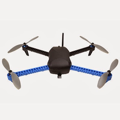
Figure 2: Here is an example of a rotary wing UAS that can be used. The site attached has many option on what to use.
Rotary Wing


The rotary wing UAS uses blades to navigate around. The blades propel the UAS up from almost anywhere. It does not need space to gain speed like that of a fixed wing UAS. With the ability to start from anywhere this eliminates the cost of having to fly in a helicopter. The UAS can move around the power line and its components very smoothly due to the stability of the blades. It can move in to take a closer picture of the power line and can hover to allow for accurate pictures. A camera is placed on the body of the UAS. It has the capabilities of taking video and still images. The video can be relayed back to a controller for immediate viewing of the condition of the power line.

The best option is to use a rotary wing UAS with a high resolution camera with video and image capabilities. The rotary wing is recommended because of the small area that is being viewed and the means of having to be able to get within a close proximity of the power lines which is helped by using the UAS’s hovering capabilities. We are eliminating the risk of human injury by removing the dangers that are presented with helicopter use. We are also eliminating helicopter transportation costs that are factored in with the choice of airport and high fuel costs. The only negative that is found is the timeframe that we are allotted. We must move quickly because of the rotary wing’s small window for fly time.
Where to find rotary wing: Rotary Wing info


Pineapple Plantation
In consulting your plantation’s operation it is my best recommendation that you would look into using the USGS’s Landsat program. The Landsat program is a satellite operation that captures images of the Earth using multispectral band imagery. The current satellite is Landsat 8 which captures an image every 16 days. That means that it flies over a spot every 16 days and takes that image. The imagery of Landsat is free to download, but to use advanced systems one would need a photogrammetry/remote sensing software program. I suggest Erdas.

To download an image of your plantation you would navigate to the USGS global visualization viewer at http://glovis.usgs.gov/. Next is to find the area that is your plantation. Once that is found I suggest choosing from the Landsat 8 collection and setting your resolution to 240 meters for a closer view. Adding that to your cart is done by highlighting your area and selecting add at the bottom of the page.  You must register with the site first, which is free. The image will either be downloaded directly or start to be process in which you would receive it at a further date by email. The file will download a Zip file which needs to be extracted. That will breakdown the Zip file into TIFF files. There will be 11 or so images files. If you are using Erdas you would want to add layers 2 through 10 and combine those as a layer stack. The image band that will work best is the short wave infrared band which is band 6 and 7. These will show your healthy vegetation as a white color. This will also help you to determine when to harvest.
If the 16 day wait period is too much for you I suggest that you used a fixed wing UAS. This will cost more, but you will have a shorter wait time to view your plantation. I suggest placing a multispectral/hyperspectral camera on the UAS if you choose this path. The process is very similar to Landsat as the camera has bands as well.
The least cost effective path is to use the free downloads from GLOVIS, but if you are looking at time constraints using a UAS may work best.


Oil Pipeline
The Niger River Delta is one of the most polluted waterways in the world and with nearby agriculture being effected I suggest that using a UAS to monitor the situation is best. Knowing that the area is also very dangerous this only backs up my suggestion. With the potential of having your pipeline leaking I suggest that a rotary wing UAS be used.

Since you are looking for the leak in a specific area the rotary wing works best. The UAS can maintain contact remotely within miles of the controller. This is a benefit as we know of the dangers of the delta. The UAS operates with blades that balance the body which usually holds a camera that can take pictures or record videos. The UAS operates like helicopter which takes off vertically. Unlike a helicopter the maneuvering is very simply as one can move freely around objects. This allows for movement around the oil pipeline which allows for better observation for the like. Once the leak is found then the UAS can take a video or images. I suggest a high resolution camera for this task as it will best to have a small level of uncertainty in this project.
I hope this has helped out.

Mine
I have looked at the options for understanding the operation in which you are partaking. For this it is in my best judgment that for your mine you should consider using a fixed wing UAS. I understand that you do not have the funds for a LiDAR sensor. My suggestion is that you look into a point cloud system on a UAS. Point Cloud is a system which takes points of a surface and measures that surface using elevation.


I have suggested fixed wing because of your spatial area. I know that this mining operation is quite large and doing a quick fly over will suffice. With your fixed wing system I have suggested a point cloud feature. By doing this on a weekly basis you can measure how much you have removed by using a formula with the elevation difference. The process should be done using a DEM or digital elevation model. This model will be a 3D representation of your mine and again you can see what the changes are. 

Sunday, February 9, 2014

Terrain Modeling

Introduction
The second of our activities was to create 3D terrains using interpolation methods. The data for this activity was the X, Y, and Z coordinates from activity 1. The five interpolation methods were IDW, Natural Neighbors, Kriging, Spline, and TIN. The idea was to determine which of these five would yield the best view for the group’s results.
Figure 1: Here are the points in ArcScene to make a 3D image


Methods
The data was entered into ArcMap and ArcScene. To create the 3D terrain the Interpolation tool had to be utilized. This is found in the ArcToolbox under Spatial Analyst then Interpolation. The terrains started as 2D models but by using base heights in ArcScene they were changed to 3D scenes. The points were placed in ArcScene to make a 3D image. These points are the points that were taken and then placed into XYZ format.
IDW
Figure 2: This is the IDW terrain. This looks to be one that should be used less than the others. IDW uses a weighted average to predict cell size.

Natural Neighbor
Figure 3: Natural Neighbor Interpolation finds the closest input samples and applies weight to them based on other cells that are proportionate.


Kriging
Figure 4: Kriging uses natural phenomena to predict the value of cells. It takes into account uncertainty. 


Spline
Figure 45 Spline uses a method that estimates values mathematically. The Spline method uses a curvature of the surface to estimate values.


TIN
Figure 6: TIN looks to be the most reliable and has a higher accuracy than most. Triangles are used to show elevation and the triangles can be placed in irregular areas.


Discussion
3D modeling of imagery is one of my favorite aspects of geography. I rather enjoyed looking at the images and analyzing them. That’s what got me through the data collection part. All in all our group worked well together. Everyone involved brought something to the table and we all agreed on almost everything. This part of the class did not really involve much group cooperation rather than talking with data.

Conclusion

This activity was rather an enjoyment and it helps with future endeavors. To have this knowledge and apply really works in the real world. The ability to run these tools is fairly easy if you enter the data correctly. For visualization purposes Kriging looks to be a better measure of accuracy. Kriging also takes into account natural phenomena in its algorithm to predict values. Using IDW and weighted average could skew areas because terrains that differ and are relatively close could skew the results. Natural Neighbor and looking at cells that have similar values could make a better view. Spline uses curvature to estimate values and by using that curvature could throw off results. A TIN is a very common DTM method because of its ability to place triangles in irregular areas that would be harder to measure.

Exercise 1: Creating Elevation Surface

Introduction

The first activity was to create an elevation surface and record points on the surface using X, Y, and Z fields. The elevation surface was made in a planter box/sandbox. Each group had to make land features. These features were a ridge, a hill, a depression, a valley, and a plain. The box was separated into grids which were the group’s X and Y points. The X points were either the highest point of a square or the lowest point depending on the elevation feature.

Methods
The first step for the activity was to create a coordinate system. Our group marked out 8 centimeter incriminates on the box. Our X coordinates were the width or the short-side of the box with the length or long-side being our Y coordinates. The group ended up with 13 points on the X and 29 on the Y. The top of the box was used as sea level.
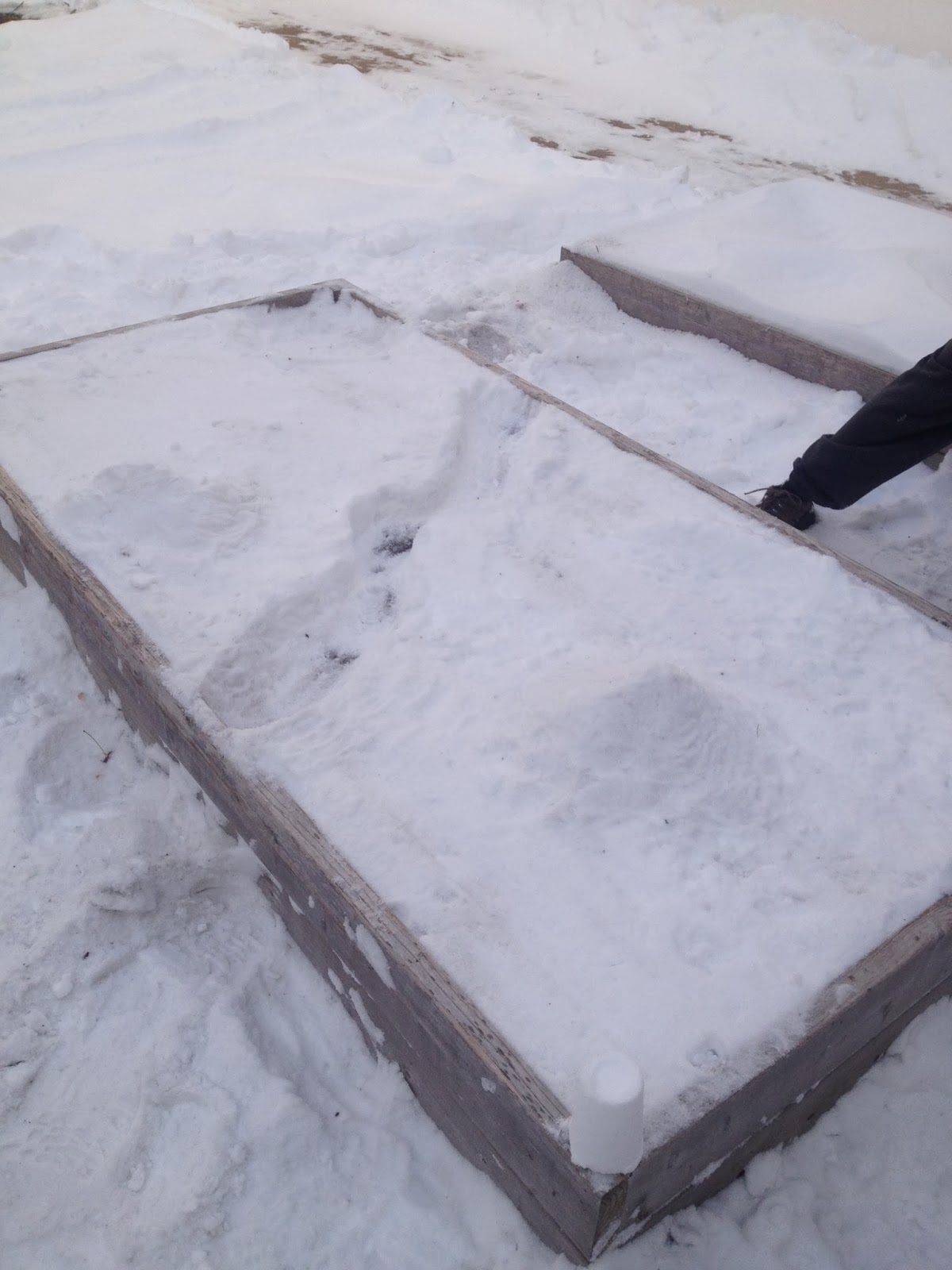
Photo 1: The planter box before surface creation


The next step was to create the features. Again, these features were a ridge, hill, depression, valley, and plain. The group compacted the snow to higher elevations to create the ridge and hill, the valley was created by making a meandering feature at low elevations, the depression was created by digging down below the designated sea level, and the plain was made flat at sea level.
Photo 2: Completed surface

After the creation of our survey area the group made a grid. The grid was made using the 8 centimeter incriminates and string. The string ran across the X and Y coordinates. The grid was used to locate the elevation of the X and Y coordinates. The group used centimeters on a meter stick to record the elevation. The elevation range was from -12 cm to 14 cm. To measure the elevation our group used the base level and either added for the ridge and hill or subtracted for the depression and valley. The plain was consistent at 0 throughout.
After the data collection we entered all the data into an Excel spreadsheet and formatted it for importation into ArcGIS.
Photo 3: Completed surface with grid


Discussion
This was activity was very interesting and fun to do. Even though it was cold I feel that our group had a solid area made. I have never done anything like this before and it will be useful to have when I look for further endeavors. I think that using negative numbers worked well because then we can see the spread of elevations much easier in Arc. The toughest parts were the cold and the snow which had a hindrance of the project from the get go.

Conclusion
The exercise was a good learning experience which is always useful. Using a grid for X and Y coordinates a good idea. Collecting data like this brings a whole new knowledge and experience to people. I am willing to bet that not many have done this before. The next step is to place all the points into Arc and create various elevation models.